How to Choose a Background for a Quote Image
Simple ways to pick a background that keeps the text readable and the mood right.
On this page
The best background for a quote image is one that stays out of the way of your words. Choose a calm photo, a soft gradient, or a solid tone with enough contrast so every letter is easy to read.
Why the background carries half the design
A quote image is really two layers working together. The words say something, and the background sets the mood. When the two fight each other, the reader gives up and scrolls past. A great background does its job quietly, so the words feel like the obvious main event.
Think of the background as a stage. The text is the star, and the stage should make it easy to see. A busy stage with bright props pulls attention away from the line you want people to remember.
Most people decide whether to read a post in well under a second. If the background slows that first glance, you lose the reader before the message even has a chance.
Solid color, gradient, photo, or texture
There are four background styles that cover almost every quote image you will ever make. Each one has a clear best use, so you can pick fast instead of guessing.
The trick is to match the style to the job. A bold one liner does not need a scenic photo behind it, and a gentle reflective line can feel cold on a flat solid color. Start with the table below, then adjust to taste.
| Background type | Best for | Watch out for |
|---|---|---|
| Solid color | Bold short lines | Can feel flat without spacing |
| Soft gradient | Calm or modern moods | Pick low contrast color shifts |
| Photo | Emotional or scenic quotes | Busy spots hide letters |
| Subtle texture | Warm handmade feel | Keep the pattern faint |
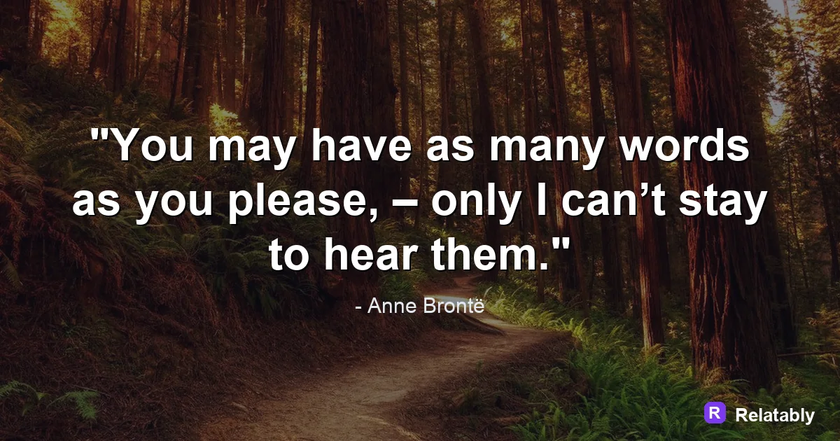
Keeping photos calm enough to read on
Photos are the trickiest background because they have light and dark areas all over. A skyline at sunset looks lovely, but the bright clouds can swallow white text in seconds.
Look for a photo with a large quiet area, like an open sky, a blank wall, or smooth water. Place your words there. The empty part of a photo is the part that helps you most.
If the only photo you love is busy all over, you still have options. You can blur it, darken it, or crop tight on the calmest slice. A little editing turns a risky photo into a safe stage for your text.
- Pick images with one calm zone for the text
- Avoid faces or objects right behind your words
- Blur the photo slightly if it feels busy
- Crop tight on a plain section when you can
Using overlays to win back contrast
When a photo is too bright or too busy, add a dark or light overlay. This is a thin layer of color placed between the photo and the text. It dims the background just enough so the words pop.
A dark overlay at thirty to fifty percent works well with white text. A light overlay does the same for dark text. The Quote Maker lets you drop an overlay in one tap, so you do not need editing skills to get clean contrast.
Readability score by background choice (test of 5 styles)
Matching the background to the mood of the line
The background should feel like the words sound. A gentle reminder to rest fits a soft blue gradient. A bold push to keep going fits a deep solid color with strong text.
Ask yourself one question before you pick. Is this quote calm, bold, or warm? Calm wants soft tones, bold wants high contrast, and warm wants gentle earthy colors or a cozy texture.
When the mood of the background matches the mood of the words, the whole image feels finished. When they clash, even a perfect font and clean spacing cannot fully save it. Mood is the glue that holds a quote image together.
Backgrounds that fit each platform
Where you post changes what background works. A feed full of bright photos rewards a calm, simple background that stands out by being quiet. A text heavy feed rewards a little color.
It also helps to think about the shape of each space. A tall background suits a pin, a square suits most feeds, and a full screen vertical suits a story. Pick the shape first, then choose a background with a calm area in the right spot.
- Instagram feed: clean photo or soft gradient
- Pinterest: tall background with room at the top
- Facebook: solid color reads fast in the timeline
- Stories: dark background so text glows on phones
To go deeper, read the best colors for quotes, add text to an image, making quote images, and how to make a minimalist quote image.
Background and quote-library pairing
Use quiet backgrounds when the quote needs to feel reflective and readable.
| Decision | Recommendation |
|---|---|
| Background categories | Calm, Sky, Ocean |
| Quote-library move | Search by mood first, then adjust font and spacing around the selected line. |
| Readability check | Add a darken layer or switch text color before changing the quote itself. |
- Pick the quote before the background if the wording is the hero.
- Pick the background first if the mood or platform is already fixed.
- Keep attribution smaller than the quote but large enough to read.