Best Colors for Quote Images
How to choose a color palette that supports the message instead of fighting it.
On this page
The best colors for quote images are the ones with strong contrast and a clear mood. Pair one calm background tone with one bold text tone, and keep your whole palette to two or three colors.
How contrast decides if your quote gets read
Color is not just about looking pretty. It is about whether a reader can tell the letters apart from the background at a glance. High contrast means high readability.
Dark text on a light field, or light text on a dark field, is the safest path. When the text tone and the background tone are too close, the words seem to vanish, and people scroll on without reading.
Two colors can be lovely on their own and still fail together if they share the same brightness. A medium gray on a medium blue, for example, has plenty of color difference but almost no lightness difference. The eye needs that lightness gap to separate the letters from the background.
Three color combos that almost never fail
If you want a shortcut, lean on combos that have worked for years. These pairings give you clean contrast and a clear feeling without much thought.
You can use these exactly as they are or treat them as a starting point. Swap one tone for a slightly warmer or cooler version and the mood shifts while the strong contrast stays. Reliable pairings free you to spend your energy on the words instead.
| Combo | Mood it sends | Good use |
|---|---|---|
| Cream and charcoal | Calm and classic | Reflective quotes |
| Navy and white | Trusted and steady | Work or advice lines |
| Warm sand and deep brown | Cozy and grounded | Gentle reminders |
Picking colors that carry the right feeling
Different tones make people feel different things, even before they read a word. Blue feels calm and steady. Warm tones feel friendly and close. Black and white feels sharp and serious.
Choose your main color by the emotion of the quote. A push to act often suits a bold warm tone, while a call to slow down suits a soft cool one.
These feelings are not strict rules, and they shift a little across cultures. Still, the general pull is real, and most viewers react to it without thinking. Lean on it gently and let the color quietly back up the message in the words.
- Blue and teal: calm, steady, trustworthy
- Red and orange: energy, urgency, warmth
- Green: growth, fresh starts, balance
- Black and white: bold, clean, serious
The two color rule for clean quote design
A common trap is using too many colors at once. Three is usually the ceiling for a quote image, and two is often plenty.
Use one color for the background, one for the main text, and save a third only for a small accent like a tiny line or a credit. More colors than that and the design starts to feel noisy. The Quote Maker ships with ready palettes so you can lock in two colors that already work together.
Reader recall by number of colors used
Testing your palette on a small phone screen
Most people will see your quote on a phone, often in bright daylight. Colors that look rich on a laptop can wash out on a small screen outdoors.
Shrink your image down and look at it at arm's length. If you have to squint to read it, raise the contrast. A quick test like this catches weak palettes before you post.
It also helps to glance at the image in a different light. A palette that reads fine in a dim room can wash out by a sunny window. If it survives both, it will survive a real feed.
Building a palette that matches your brand
If you post quotes often, keep a small set of colors that is always yours. Reusing the same two or three tones makes your posts recognizable in a busy feed.
Pick a background tone, a text tone, and one accent, then save them. Consistency does the quiet work of building a look people remember.
Over weeks, this turns into a small signal. People begin to recognize your posts from the color alone, even before they read the words. That kind of quiet recognition is worth far more than chasing a new palette for every single image.
To go deeper, read choose a background for a quote image, how to add text to an image, making quote images, and minimalist quote images.
Background and quote-library pairing
Pick backgrounds after choosing contrast, not before; text must survive the image.
| Decision | Recommendation |
|---|---|
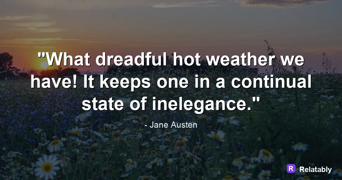
| Background categories | Calm, Flowers, Night |
| Quote-library move | Search by mood first, then adjust font and spacing around the selected line. |
| Readability check | Add a darken layer or switch text color before changing the quote itself. |
- Pick the quote before the background if the wording is the hero.
- Pick the background first if the mood or platform is already fixed.
- Keep attribution smaller than the quote but large enough to read.