How to Make a Quote Image
A simple, repeatable way to turn any line into a quote image that looks clean and reads well on a phone.
On this page
To make a quote image, pick a short line, set it on a clean background, choose a readable font, and balance the layout. A browser tool lets you finish in a few minutes with no design skills.
The four parts every quote image needs
A good quote image comes down to four pieces: the words, the background, the font, and the layout. Get all four working together and the image looks finished, and a viewer simply reads the line without ever noticing the design.
Most weak images fail on just one part, like text that is too long or a background that fights the words. This guide walks through each piece in order.
The good news is that none of these parts need design skill. Once you see how they fit together, you can make a clean quote image in a few minutes and repeat the process whenever you like.
- The quote, kept short and clear
- A background that does not compete
- A font you can read at a glance
- A balanced layout with margins
Starting with a line worth sharing
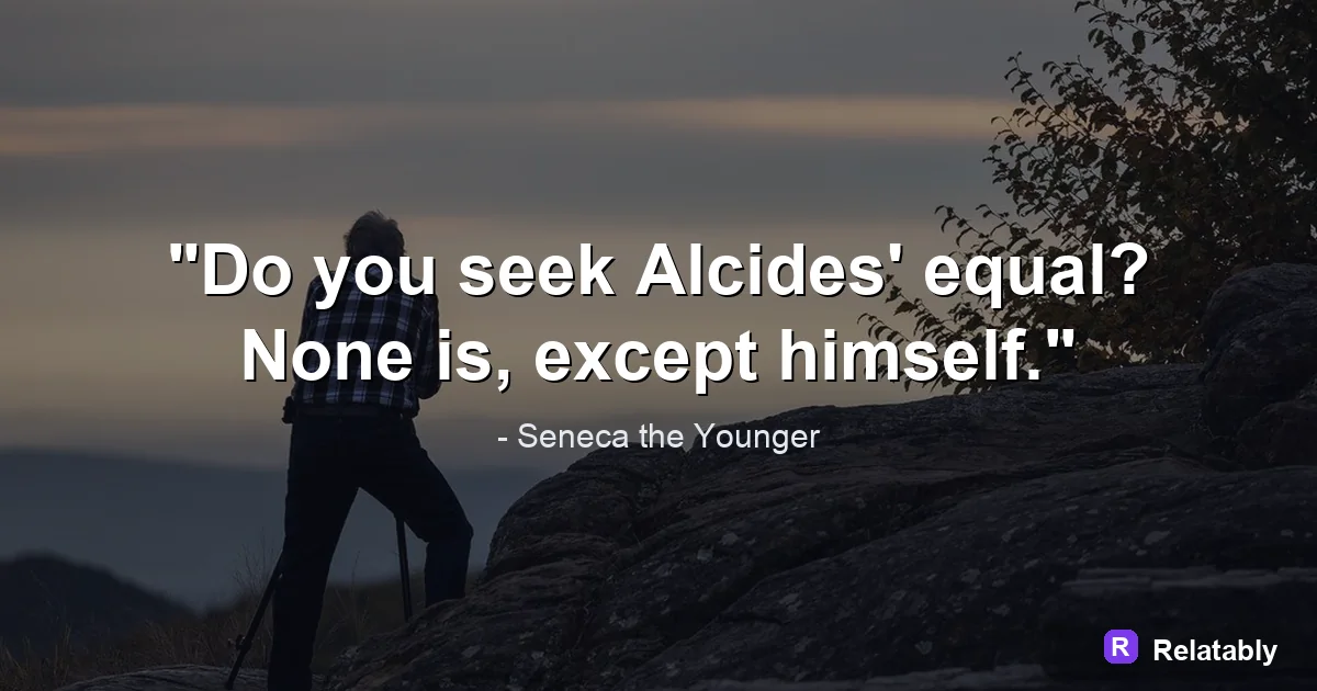
The words matter most. A sharp, short line carries the image, while a long rambling one buries it. Aim for something a reader can take in at a single look, like Small steps still move you.
If your line runs long, cut it down before you design anything. Strong wording makes every other choice easier.
Choosing a background that supports the text
A background should lift the words, not bury them. A solid color is the safest start. Photos can work, but only when you dim them so the text still reads clearly.
Match the mood of the background to the mood of the quote. A gentle line wants a soft field, while a bold line can take a stronger one.
| Background | Best for |
|---|---|
| Solid color | Clean, reliable look |
| Soft gradient | Gentle depth |
| Dimmed photo | Mood and warmth |
| Simple texture | Subtle interest |
Setting type that anyone can read
Pick one main font and keep it simple. A clean sans serif reads well everywhere, and a soft serif adds a classic touch. Avoid hard to read script for the whole line.
Make the text big enough to read on a phone, and keep strong contrast between text and background. If the two are close in tone, the words fade out.
Balancing the layout so nothing feels cramped
Layout is how everything sits together. Center the quote or place it in a clear block, and leave even margins on all sides so the text never touches the edges.
Good spacing makes an image feel calm and finished. The chart below shows roughly where your effort pays off across the whole job.
Where your effort matters most
Quick checks before you hit export
Before you download, run a short review. Most rough images get fixed in this last pass, so it is worth thirty seconds. The biggest wins are readability and breathing room.
Shrink the image on your screen to phone size. If the words are still clear, you are in good shape. If they blur or crowd the edges, bump the text size or widen the margins.
Check the contrast one more time too. When text and background sit close in tone, the line fades, and a quote image only works if people can actually read it.
- Can you read it at thumbnail size
- Do the words touch any edge
- Is the contrast strong enough
- Does the layout feel balanced
Putting it together and exporting
Once the four parts are set, build it in a browser. Open the Quote Maker, type your line, choose a background, set your font, and adjust the spacing.
Export a square for a feed, a tall canvas for a story, or a vertical pin for Pinterest. One clean design can be resized for several places without starting over.
Save the file at full quality so it stays sharp wherever you post it. A crisp image looks more trustworthy and gets shared more than a blurry one.
To go deeper, read how to make an instagram quote post, best fonts for quote images, and quote image backgrounds.
Make the advice practical in the Quote Maker
The fastest way to use this guide is to turn each design choice into a visible editor setting.
| Decision | Recommendation |
|---|---|
| Line choice | Use the quote library or paste a short line of your own. |
| Visual choice | Choose a calm background, then adjust contrast before changing fonts. |
| Export choice | Select the final platform size before downloading the image. |
- Use fewer words when the canvas is small.
- Check the design at phone size before exporting.
- Keep the author or source line visually secondary to the quote.