Best Fonts for Quote Images
A short guide to picking fonts that stay readable and feel right for the message.
On this page
The best fonts for quotes are clean and easy to read at a glance. A simple sans serif suits modern lines, a classic serif suits thoughtful ones, and a light script works only as a small accent.
What makes a font work for quote images
A good quote font does one job well. It lets a reader take in the whole line in a second without working for it. Clarity beats decoration every time.
Fancy fonts can feel tempting because they look special. But a quote is meant to be read fast and felt fast. If the shape of the letters slows the eye, the message gets lost.
A simple test helps. Glance at your image for one second, then look away and try to recall the line. If you can, the font is doing its job. If the letters got in the way, swap to something cleaner and try again.
Serif, sans serif, and script at a glance
Most quote fonts fall into three families. Knowing the feeling each one sends helps you pick the right tool for the line you are working with.
You do not have to memorize hundreds of names. Once you know how these three families behave, you can sort any new font into one of them and predict how it will read. That simple sorting saves a lot of guesswork.
| Font family | Feeling | Best use |
|---|---|---|
| Sans serif | Modern and clean | Bold short quotes |
| Serif | Classic and thoughtful | Reflective lines |
| Script | Warm and personal | Small accent words only |
When a clean sans serif is the right call
A sans serif font has no little feet on the letters. That makes it feel modern and keeps it sharp even at small sizes.
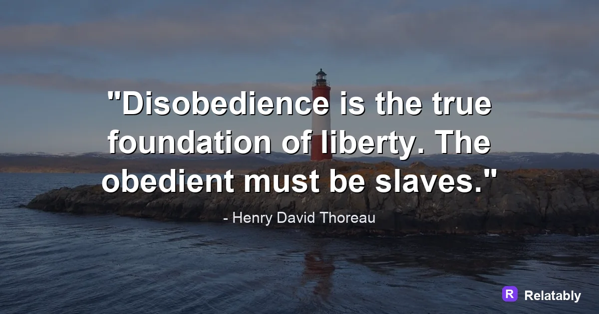
Reach for a sans serif when the quote is bold, punchy, or meant for a fast feed. It reads cleanly on phones and never feels old fashioned.
Sans serifs also hold up well when you stack words in a tight block, which is common in quote design. The clean shapes do not crowd each other, so the lines stay crisp even when they sit close together.
- Use for short, strong, modern lines
- Great for Instagram and Facebook feeds
- Stays readable when the image is small
- Pairs well with bold weights for emphasis
Why script fonts work best in tiny doses
Script fonts mimic handwriting and feel warm and personal. The problem is they get hard to read when there are many words close together.
Use a script for one or two words you want to highlight, not the whole quote. A full sentence in a flowing script often turns into a puzzle. If you want a handwritten feel for a longer line, pick a clean print style instead.
Heavy decorative fonts fall into the same trap. They can look striking in a logo, but a whole quote set in them becomes work to read. Save those styles for a single word and let a clear font carry the rest.
Readability of font families at small sizes
Sizing and weight that make text pop
The font you pick is only half the story. Size and weight decide how strong it feels. A great font set too small still fails.
Make the main line large and give it a bold or medium weight. Let a credit or extra note sit smaller and lighter underneath. This difference in size guides the eye to the important words first.
Be careful not to push the weight too far. A font set in its heaviest style can feel cramped, with the letters almost touching. A medium or bold weight usually gives you presence without losing the air around each letter.
Picking a font fast without overthinking it
You do not need to test fifty fonts. Start with one clean sans serif and one classic serif, and you can handle almost any quote.
The Quote Maker groups fonts by mood, so you can try a modern or classic look in a tap. Pick one that reads clearly, then move on.
To go deeper, read pairing fonts for quotes, quote design principles, how to make a quote image, and space text on a quote image.
Make the advice practical in the Quote Maker
The fastest way to use this guide is to turn each design choice into a visible editor setting.
| Decision | Recommendation |
|---|---|
| Line choice | Use the quote library or paste a short line of your own. |
| Visual choice | Choose a calm background, then adjust contrast before changing fonts. |
| Export choice | Select the final platform size before downloading the image. |
- Use fewer words when the canvas is small.
- Check the design at phone size before exporting.
- Keep the author or source line visually secondary to the quote.