How to Make a Meme for Instagram
How to size and make a meme that looks right on Instagram.
On this page
For Instagram, build your meme as a clean square or vertical image, keep text away from the edges, and make captions large enough to read in the feed. The right size and safe margins matter as much as the joke.
Choosing a shape that fits the Instagram feed
Instagram favors square and vertical images because they take up more of the screen as people scroll. A wide landscape meme shrinks and gets skipped.
Pick your shape before you design. Building for the right frame from the start saves you from awkward crops that cut off your punchline.
If you are not sure, the square is the safe default for the main feed. It posts cleanly and rarely gets cut. Save the tall 9 by 16 shape for Stories and Reels, where the full vertical screen is yours to fill.
| Format | Shape | Best use |
|---|---|---|
| Square post | 1 by 1 | Most feed memes |
| Vertical post | 4 by 5 | More screen space |
| Story or reel | 9 by 16 | Full screen vertical |
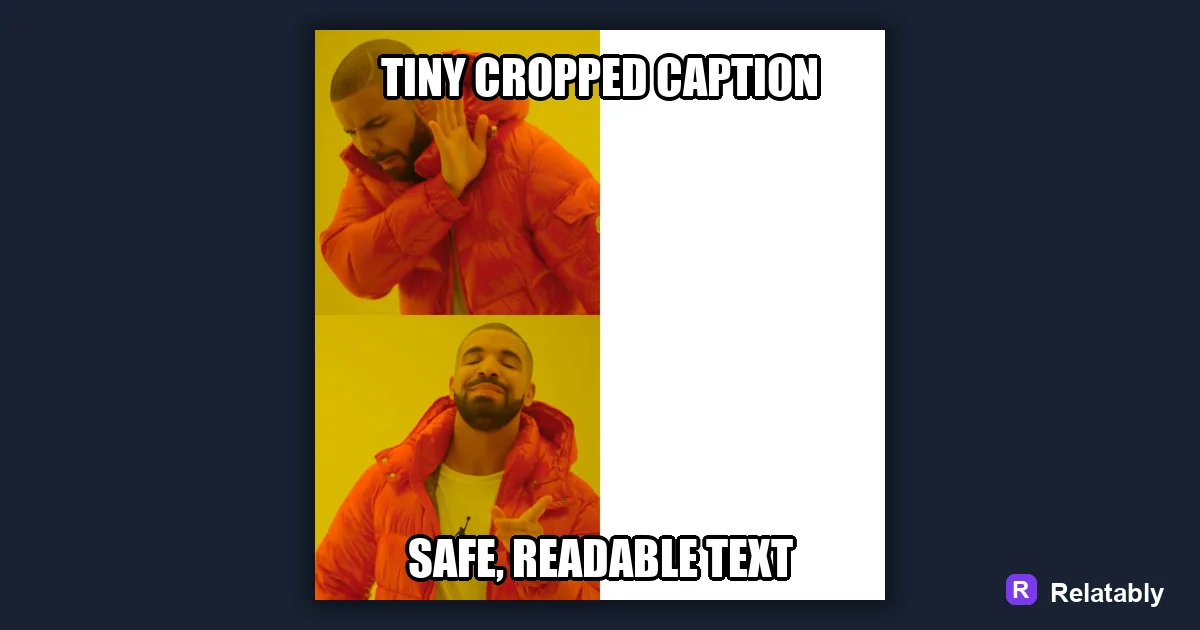
Keeping text out of the danger zones
Instagram covers parts of your image with its own buttons and labels, especially in Stories. Profile icons, captions, and tap zones can sit right over your text. What looks clean while you design it can end up half hidden once the app layers its own elements on top.
Leave a margin around all four edges. Push your caption toward the middle so nothing important hides behind Instagram's own interface.
This matters most in Stories, where the top and bottom strips get crowded fast. Keep your punchline in the safe middle band of the screen. If you treat the outer edges as off limits, your text survives no matter what Instagram stacks on top.
Sizing captions for thumb scrolling
People view Instagram on phones held at arm's length, often scrolling fast. Tiny text loses them before the joke lands.
Make your caption large and bold with a strong outline. If you can read it on a phone preview without squinting, it will survive the feed.
Contrast is just as important as size. Light text on a dark photo or dark text on a light photo reads instantly. When the background is busy, a solid bar behind the words keeps them clean and easy to catch at a glance.
- Use a thick font with a clear outline
- Fill more of the frame with the words
- Avoid thin script fonts that blur when small
- Check the preview at phone size before posting
Using the image and the written caption together
Instagram gives you two captions, the text baked into the meme and the written caption below the post. Let them work as a team, not a repeat.
Put the punchline in the image and use the written caption to add a tag, a question, or a setup. That nudge gets people to comment and share.
Asking a small question below the meme works well. Something like which one are you invites replies, and replies push your post to more feeds. The image earns the laugh while the written caption earns the conversation.
Which format gets seen most in the feed
Different shapes pull different amounts of screen space, and screen space drives how many people stop scrolling. Knowing which formats hold attention helps you pick before you build.
Screen space by Instagram meme format
Exporting and posting your Instagram meme
Open the Relatably Meme Generator, set your canvas to a square or vertical size, and add your caption inside the safe margins. Export at high quality so the text stays crisp after Instagram compresses it.
Before you post, view the preview on your phone. If the text reads clearly and nothing sits under the corner icons, it is ready for the feed.
It is worth checking the meme in both the feed and the Story view if you plan to share it in both. The same image can read perfectly in a square feed yet lose its top line behind a Story label. A quick look in each spot saves you from posting a meme with a hidden punchline.
Instagram meme sizes at a glance
A meme that fits the Instagram feed cleanly gets seen more, so size it before you post.
A square or 4:5 portrait fills the feed best, while a wide meme shrinks and gets harder to read. Keep your caption clear of the outer edges so the app does not trim it.
| Placement | Value |
|---|---|
| Feed square | 1080 x 1080 pixels (1:1) |
| Feed portrait | 1080 x 1350 pixels (4:5) |
| Story | 1080 x 1920 pixels (9:16) |
| File types | JPG and PNG |
To go deeper, read meme sizes for social media and making a meme.
Instagram meme publishing checklist
Use this quick check before exporting so the design works in the place it will actually be posted.
| Decision | Recommendation |
|---|---|
| Recommended size | 1080 x 1080 or 1080 x 1350 |
| Safe-zone check | Keep captions large and far enough from the crop edges. |
| Export check | Preview the image at phone size and make sure the smallest text is still readable. |
- Keep the quote or meme text inside the safest central part of the canvas.
- Use PNG when text crispness matters most, or WebP when file size matters more.
- Write supporting post copy only after the image reads clearly on its own.