How to Make a Comparison Meme
How to build a meme that compares two options.
On this page
A comparison meme puts two choices side by side so the gap between them does the joke. Pick one clearly worse option and one clearly better option, then label each with short text.
What makes two options feel funny next to each other
A comparison meme works because your brain expects fairness and the meme breaks it. One side looks small, sad, or weak. The other side looks big, proud, or smug. The bigger the gap, the harder people laugh.
The trick is picking two things your audience already has feelings about. If both sides feel equal, there is no joke. You want a clear winner and a clear loser in the same frame.
Think about how a teacher might compare a messy desk to a neat one. You instantly know which one you would rather have. That gut reaction is the engine of every comparison meme, and your only job is to point it at a topic people care about.
Choosing the weaker side and the stronger side
Start by naming the better option in your head. Then find the version of it that people quietly judge. That weaker version becomes your setup, and the stronger one becomes the payoff.
Try to keep both sides in the same family so the comparison feels fair. Comparing two phones, two morning routines, or two ways to text a friend reads cleanly. Comparing two things from totally different worlds confuses people and the joke gets lost.
- Old habit on the left, new habit on the right
- What you planned versus what actually happened
- Beginner move next to the expert move
- Cheap version beside the fancy version
- How it looks online versus how it looks in real life
Two layouts that read in one second
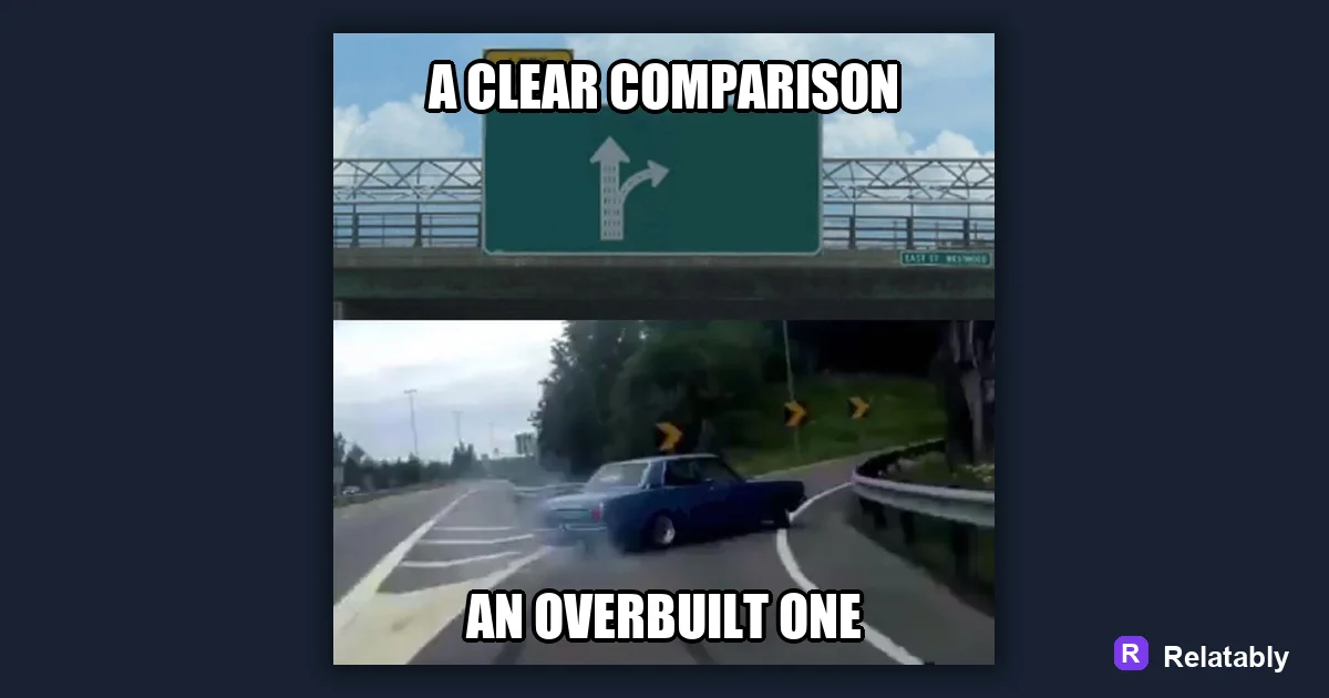
Most comparison memes use one of two shapes. A split image shows both sides at once. A stacked image puts the weak side on top and the strong side on the bottom. Both work, so pick the one that fits your picture.
If your images are wide, a top and bottom stack reads better on phones. If they are square, a side by side split feels natural. Match the layout to the pictures you already have rather than forcing a shape that crops out the good part.
| Layout | Best for | Watch out for |
|---|---|---|
| Side by side | Two pictures of equal size | Text getting cramped |
| Top and bottom | Tall phone screens | People missing the bottom half |
| One frame, two labels | A single busy photo | Confusing which label goes where |
Labeling each side so nobody guesses
Each side needs a short label, usually two to five words. The label tells the viewer what they are looking at. Keep the words plain so the joke lands fast.
Put the label near the part it describes. If a label floats in the wrong corner, people read the joke backward and it falls flat. A clear label on each side keeps the meaning locked in.
You can also play with the wording. Make the weak side sound a little proud and the strong side sound plain, or the other way around. A small twist in the label can squeeze an extra laugh out of the same two pictures.
How much the gap should lean before it stops working
A comparison meme needs an uneven gap, but not a fake one. If you push it too far, people feel tricked instead of amused. The sweet spot is a gap people already believe.
When a comparison is honest, people nod before they laugh. They recognize the gap from their own life. When it is too stretched, they stop to argue with it, and a meme that starts an argument is not landing the joke you wanted.
How well a comparison lands by gap size
Building the split in a meme tool
You do not need photo editing skills for this. Open the Relatably Meme Generator, drop in your two images or one wide photo, then add a short label to each side. Line the labels up with the matching half and you are done.
Before you post, cover one side with your thumb. If the visible half still hints at the joke, your sides are balanced and the contrast is strong.
To go deeper, read the meme template guide, how to make a top and bottom text meme, making a meme, and two-panel memes.
Best template direction for this meme
A comparison template gives each side a clear label so the joke reads in one glance.
| Decision | Recommendation |
|---|---|
| Start with | Comparisons |
| Caption length | One short setup line, plus a payoff only if the format needs it. |
| Editor move | Open a blank template, add text boxes, then drag captions away from faces and key details. |
- Browse the template category before writing the final caption.
- Test one literal caption and one exaggerated caption; keep the faster one.
- Export and check the meme at phone size before posting.