Best Meme Fonts
Which fonts fit a meme, when to use the classic look, and when a clean caption font works better.
On this page
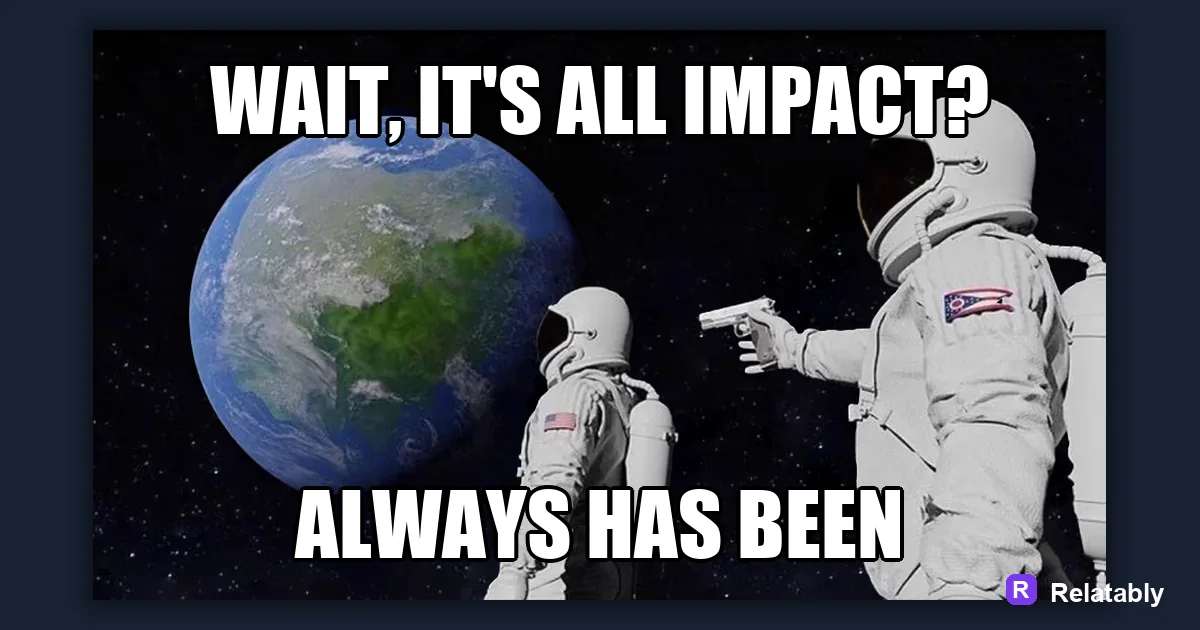
The most reliable meme font is Impact in bold white with a black outline, because it stays sharp and easy to read on almost any image. For softer or modern memes, a clean sans-serif like Arial Bold or Anton works well too.
Why Impact became the default meme typeface
Impact has been tied to memes since the early days of top and bottom text jokes. It is heavy, condensed, and almost shouts at you, which is exactly what an internet caption needs to do. The look became so common that people now read it as a signal that something is meant to be funny.
The thick strokes hold up when an image gets compressed or shrunk down to a thumbnail. That durability is the real reason it stuck around, not nostalgia. Plenty of prettier fonts exist, but few survive the trip through a phone screen the way Impact does.
It also ships on most devices, so the same caption looks the same for everyone. That consistency matters when a meme spreads across phones, laptops, and screenshots of screenshots.
How weight and stroke thickness affect readability
A meme font lives or dies by its weight. Thin letters vanish against a busy photo, while a bold weight punches through clutter and reads from across the room. People scroll fast, so your caption gets a fraction of a second to register.
Condensed fonts also let you fit more words per line without shrinking the text. That matters a lot when your punchline runs long, since you never want to drop the font size just to squeeze a sentence in.
The chart below shows roughly how legible the same caption stays as you move from a thin weight to a black one. The jump from regular to bold is where most of the readability is won.
Readability score by font weight on a busy photo
Pairing the right font with the meme mood
Not every joke wants to scream. A wholesome or quiet caption can feel friendlier in a rounded font, while a chaotic post loves something loud and ugly on purpose. The shape of the letters sets the mood before anyone reads a word.
Match the typeface to the tone you want. The font is part of the joke, not just a delivery vehicle, and the wrong one can make a soft punchline feel harsh or a sharp one feel limp.
Use the table as a starting map. Swap in your own favorites once you see how each style changes the feel of the same caption.
| Meme mood | Font to try | Why it fits |
|---|---|---|
| Classic loud | Impact | Heavy and instantly readable |
| Modern clean | Anton | Tall, sharp, social ready |
| Soft or wholesome | Poppins | Rounded and warm |
| Deadpan text | Arial Bold | Plain on purpose |
When a sans-serif beats Impact
Impact can look dated for certain styles. Caption-card jokes, quote-style memes, and minimalist posts often read better in a plain sans-serif with normal letter spacing. The clean look reads as modern and lets the words feel deliberate.
If your meme leans more thoughtful than rowdy, drop the all-caps shouting and let a calmer font carry it. A relatable observation often hits harder when it is not yelled at the reader.
These picks all stay sharp on a phone and pair nicely with most photos.
- Anton for a modern tall headline look
- Montserrat Bold for clean social posts
- Bebas Neue for narrow stacked lines
- Arial Bold when you want zero personality on purpose
Setting up outlines and contrast so text never disappears
Font choice means nothing if the color blends into the background. A black outline or drop shadow keeps white letters visible over light and dark areas alike, which is why classic memes almost always use that combination.
You can stack a thick black stroke around white fill in the Meme Generator and the text stays sharp no matter what photo sits underneath. The outline does the heavy lifting that the font alone cannot.
If you ever feel unsure, test your caption against the busiest part of the image. If it reads there, it reads everywhere.
Fonts that quietly ruin a meme
Some typefaces fight the joke. Script fonts, ultra-thin styles, and anything with low contrast make people squint instead of laugh, and a squinting reader rarely shares.
Comic Sans gets used as a punchline itself, but outside of irony it reads as a mistake. Save the fancy and decorative fonts for greeting cards and posters where people slow down to look.
When in doubt, pick the boring bold option. A plain readable caption always beats a stylish one nobody can decode.
- Thin handwriting fonts that break up on small screens
- Tight script that turns words into a blur
- Pale gray text with no outline
- Decorative fonts where letters touch and merge
To go deeper, read how to write meme captions, add text to a meme, how to make a meme, and making a meme fast.
Turn the idea into a finished meme
Use the template library as a creative constraint: pick the format first, then write the caption to fit that format.
| Decision | Recommendation |
|---|---|
| Template choice | Reaction, comparison, panel, classic, or blank utility |
| Caption test | Can someone understand the setup in under two seconds? |
| Final check | Does the image still work if the caption is read on a small screen? |
- Use a recognizable blank when speed matters.
- Use your own photo when the specific moment is more important than the format.
- Cut any caption word that explains what the image already shows.