How to Make a LinkedIn Quote Image
How to make a quote image that looks professional in the LinkedIn feed.
On this page
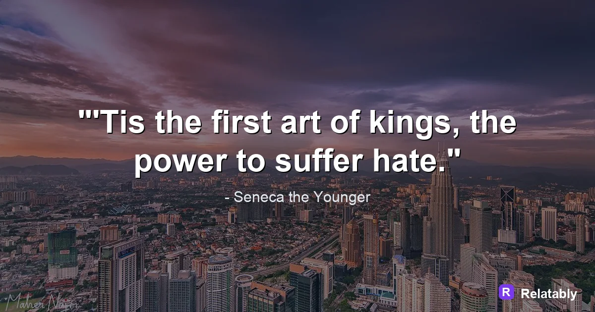
To make a LinkedIn quote image, choose a clean, professional design with a short business minded quote and your name or title. Keep the look simple and on brand so it fits a feed built around careers and work.
What makes a quote image feel professional
LinkedIn is a workplace feed, so the tone leans serious and polished. A quote image fits in when it looks clean and calm rather than loud or playful. Plain backgrounds and tidy fonts read as professional.
The quote itself should connect to work, growth, or leadership. A clear, useful idea performs better than a flashy one on a network built around careers.
Restraint is part of the look. Skip loud effects, busy backgrounds, and joke fonts. The people scrolling are often on a work break or between tasks, and a clean image respects that and reads as serious.
Choosing quotes that fit a work audience
Not every quote lands on LinkedIn. Lines about effort, learning, teamwork, and resilience match the mood of the feed. Avoid quotes that feel too casual or off topic for a professional space.
Keep the quote short and sharp so a busy reader can take it in between meetings. One strong idea beats a long, wordy passage.
If you write your own line, that can work even better. A short thought from your own experience feels honest, and people often respond more to a real voice than to a famous name they have seen many times.
- Quotes about growth and learning
- Lines on teamwork and leadership
- Notes on focus and discipline
- Short takes on handling setbacks
- Ideas about career and purpose
Building a clean, on brand layout
A LinkedIn quote image should look like it belongs to you or your company. Use your brand colors, a simple font, and your logo or name in a corner. Steady styling helps people recognize your posts.
Leave plenty of space around the words. A crowded design feels rushed, while open space feels confident and considered.
Build a simple template you can reuse. Once the colors, font, and logo spot are set, you can drop in a new quote each week and the post still looks like part of one steady, professional set.
- Use one or two brand colors
- Keep to a single clean font
- Add your name, title, or logo in a corner
- Leave generous space around the text
- Skip busy backgrounds and heavy effects
Sizing the image for the LinkedIn feed
LinkedIn shows images at a set width in the feed, so picking the right shape keeps your text from getting cropped. Square and portrait shapes tend to fill more of the screen on a phone.
Keep your key words near the center so nothing gets clipped in the preview. A safe margin around the edges means your message stays whole on both a laptop and a phone. The table shows shapes that work and where they fit best on the platform.
| Shape | Best use on LinkedIn |
|---|---|
| Square | Standard feed posts |
| Portrait | Taller posts that fill phone screens |
| Landscape | Article headers and link cards |
How professional polish drives engagement
On LinkedIn, polish and relevance carry a quote post. A clean design earns trust, and a work focused message earns shares and comments from your network.
The chart shows a rough split of what tends to lift engagement on a LinkedIn quote image.
What lifts a LinkedIn quote image (impact share)
Designing and posting your quote image
Once your quote and brand details are set, lay them out so the message reads first and your name reads second. Keep the design tidy and the text large enough to read on a phone.
You can build the image in the Quote Maker, then export a square or portrait file and post it with a short caption sharing your own take. Adding your view in the caption invites your network to weigh in.
Reply to the first comments soon after posting. Early replies keep the conversation alive, and a lively comment thread tells LinkedIn the post is worth showing to a wider part of your network.
LinkedIn quote sizes and limits at a glance
LinkedIn favors a clean, professional look, and the sizes are close to Facebook.
A square post shows in full in the feed, while a shared link uses the wide 1.91:1 card. Skip loud colors and busy photos here, since a calm, simple design reads as more professional.
| Placement | Value |
|---|---|
| Feed square | 1080 x 1080 pixels (1:1) |
| Shared link card | 1200 x 627 pixels (1.91:1) |
| Max file size | About 7 MB |
| Post text limit | 3,000 characters |
| File types | PNG and JPG |
To go deeper, read make an instagram quote post, make a pinterest quote pin, making quote images, and how to make a quote story image (instagram).
LinkedIn publishing checklist
Use this quick check before exporting so the design works in the place it will actually be posted.
| Decision | Recommendation |
|---|---|
| Recommended size | 1200 x 627 |
| Safe-zone check | Keep the tone professional and leave room for the post text to add context. |
| Export check | Preview the image at phone size and make sure the smallest text is still readable. |
- Keep the quote or meme text inside the safest central part of the canvas.
- Use PNG when text crispness matters most, or WebP when file size matters more.
- Write supporting post copy only after the image reads clearly on its own.